Elizabeth
Dulemba
is an award-winning children's book author, illustrator, teacher, and speaker with
over two dozen titles to her credit, from board books to a young adult novel. She just
competed an MFA with Distinction in Illustration from the University of
Edinburgh College of Art and will begin a PhD in Children’s Literature at the
University of Glasgow School of Education, fall of 2017. In the summers, she is
Visiting Associate Professor in the MFA in Children’s Book Writing and
Illustrating program at Hollins University (Virginia, US). Currently, she is
illustrating a picture book by Caldecott-winning author, Jane Yolen and Adam Stemple, for
Cornell Lab Publishing Group (2018). Learn more at: www.dulemba.com.
My dissertation
objective was to observe similarities and differences between award-winning
children’s book titles from the US and UK to see if trends or cultural
differences could be identified. As an American creator studying in the UK, I
wanted to understand what works in both countries and what doesn’t. By
comparing a decade’s worth of titles from the US
Randolph Caldecott Medal run by the Association for Library Service to Children and the UK Kate Greenaway Medal
run by the Chartered Institute of Library and Information Professionals, I learned a great deal about design variations within the two
cultures.
I also located
some aesthetic homogenization through analysing these select titles, finding interesting signifiers in two titles especially that
deserved further exploration. They were Sophie Blackall’s Finding Winnie (Mattick and Blackall, 2015) and Jon Klassen’s This is Not
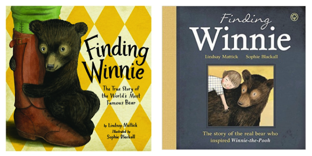
My Hat (Klassen, 2012). We’ll begin with differences between the US cover of Finding Winnie (left), and the UK cover
(right).
Figure 1 & 2 - Covers collected from Amazon.com (US) and
Amazon.co.uk (UK) respectively
Here we can observe
the negative vs. positive space distribution. It is less prominent on the US
cover, where the image takes up more space and Winnie faces and engages the
viewer. In contrast, the UK version has more negative space, with the imagery
neatly framed upon a sombre background, implying distance. As Perry Nodelman
says in Words About Pictures, “…looking
at events through strictly defined boundaries implies detachment and
objectivity, for the world we see through a frame is separate from our own
world...” (Nodelman, 1988, p50)—engagement vs. distance.
This idea is
reflected in the different font treatments and how they place emphasis on
different words within the titles. Both the words Finding and Winnie have
equal weight on the US cover, while on the UK cover, Finding has been allotted less gravitas. Therefore, the US cover
implies that the action of “Finding
Winnie” is the dominant theme, whereas the UK cover implies that the character of “Winnie” is the focal
point—action vs. character.
The Finding Winnie covers are prime examples of a key difference
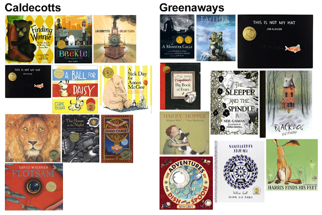
between the two data sets—colour. I combined the ten
covers from each set of titles into one image in Photoshop™ as shown here.
Figures 3 & 4 - Caldecott and Greenaway-winning titles.
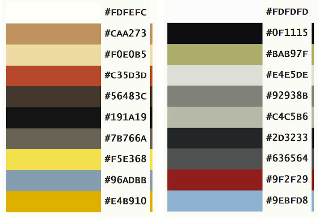
I then employed PaletteGenerator.com
to analyse the images, presenting their colour usage through percentage
breakdowns. Here we see the top ten most prominently employed colours in each
conglomerated dataset, the Caldecott palette on the left and the Greenaway
palette on the right—warm vs. cool.
Figure 5 - Palettes created at PaletteGenerator.com
As reinforced in the covers of Finding Winnie, we see two yellows on
the US side, and no yellows at all on the UK side. In Roland Barthes’ “Rhetoric
of the image,” he explains that compared images “… require a generally cultural
knowledge, and refer back to signifieds each of which is global (for example,
Italianicity), imbued with euphoric values” (Barthes, 1977, p154). These two covers exemplify
Americanicity and UKicity between the cultural contexts.
But why is this? As publishing
companies merge and align their publishing goals, it can be assumed that
marketplace differences should be growing less pronounced, leading to an aesthetic homogenization of
cultural content. On the positive side of this idea, Gillian Lathey says, “The ‘language’ of pictures is generally regarded as
international, capable of transcending linguistic and cultural boundaries” (Lathey, 2006, p113). However,
Martin Salisbury expresses concern that “The rich
diversity of artwork from across the globe is increasingly threatened by the
growing necessity for publishers to sell co-editions of their books to other
countries, most importantly the USA” (Salisbury, 2007, p6).
Indeed, crossover
books between the US and the UK have become mainstream. Many top publishing houses in the US, like Penguin Random House, HarperCollins Children’s Books, and Macmillan have offices and headquarters in the UK, or closely
related divisions like Walker (UK) is to Candlewick (US). The US and UK share a
healthy crossover of content and titles with publicity oftentimes aimed at both
countries as they share the same marketing goals. In fact, UK books often rely
on licensed US sales to make a profit beyond their geographically limited
marketplace.
Therefore, it is
surprising that only one book in my dataset proved this homogenization by
remaining identical in both markets, Jon Klassen’s This is Not My Hat (Klassen, 2012), despite being created by a Canadian author/illustrator, picked up
by a US publisher (Candlewick), and sold to their UK counterpart, Walker Books.
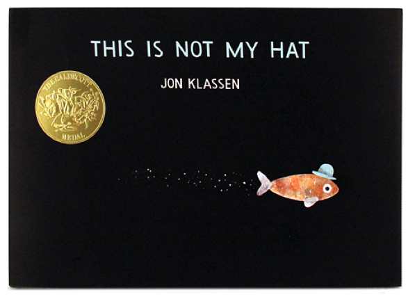
As such, we can learn much by analysing this cover:
Figure 6 - This is Not My Hat (Klassen, 2012)
Despite the book’s
popularity, some critics disapprove of the story’s message, a suggestion that capital
punishment is justifiable for theft (“This Is Not My
Hat by Jon Klassen"). It’s
a book that evokes
strong reactions. Perhaps the controversy is one
reason why the book did so well in both markets: it drew attention.
If we look at This is Not My Hat in comparison to the other award-winning titles,
further reasons become clear. The cover design utilises
broad areas of negative space with an anthropomorphized character who is both
distant and looking at the viewer, while in motion. The colour palette has both
a sombre background and bright fish—warm and cool.
This implies that
the separate Americanicity and UKicity of books is diminishing rather than
broadening. Salisbury says, “A tour of the annual Bologna Children’s Book Fair,
for instance, reveals that, at present, UK publishers are deeply conservative
in their use of illustration as compared to, i.e., their French, Italian,
Norwegian, German and Scandinavian counterparts. When asked about this, most UK
publishers will claim that, much as they love the ‘sophisticated stuff’, they
can’t sell it. It is never easy to know who is leading whom here,…” (Salisbury, 2007, p6).
Does that mean
that publishers are intentionally seeking books that will translate into both
US and UK markets without adaptations—that books are indeed becoming
aesthetically homogenized?
When asked what
some of the key differences between the UK and US markets for children’s books
today are, Tessa Strickland responded, “I don’t really see myself as developing
books for the UK and the US; what I notice is that the books attract people
with a certain kind of sensibility, and those people can be anywhere in the
world… there are far more similarities than differences and with very few
exceptions, the same books tend to do well in both markets” (Withrow and Withrow, 2009, p179).
As our markets
become more global in scope, perhaps their separateness is the strangest thing
about them, as books like This is Not My Hat (Klassen, 2012) suggests we may see more crossover award-winners in the future.
Indeed, the most recent UK Carnegie and Greenaway winning titles, Salt to the Sea by Ruta Sepetys (Sepetys, 2017) and There is a Tribe of Kids by Lane Smith (Smith, 2017) were created by Americans.
A recent personal visit to the
Bologna Children’s Book Fair (2016) revealed a vast range in picture books from
around the world, including the US and UK. Certainly, some aesthetic homogenization was
evident; however, overall, distinctly different products were displayed.
Perhaps it’s the diversity of our markets that makes
them so rich and interesting. “As Cotton notes, the picture book is one of the
most accessible means of conveying cultural values; thus it has the potential
to be an effective agent in the dissemination of a sense of respect for the
attitudes of others” (Harding et al., 2008, p9).
In conclusion, we can infer that our
cultural backgrounds influence differences between the two sets of books, but
perhaps more commonality is achieved through the dedication of producing
appealing works in general. Harding sums up the idea
well, “…a good deal of mutual understanding of our different cultures can be
disseminated by the interchange of picture books… In spite of all we have in common,
there is an amazing richness available to us whenever we look beyond our
national boundaries” (Harding et al., 2008, pp9-10).
Bibliography
Barthes, R., & Heath, S.
(1977). "Rhetoric of the image". Image,
music, text. New York: Hill and Wang.
Children’s Books Guide. (2012). This Is Not My Hat by Jon Klassen. http://www.ChildrensBooksGuide.com
Harding, J., Pinsent, P., International Board on Books for
Young People, National Centre for Research in Children’s Literature (Eds.). (2008).
What do you see?: international
perspectives on children’s book illustration. Newcastle: Cambridge Scholars.
Klassen, J. (2014). This
is not my hat. London: Walker Books and subsidiaries.
Klassen, J. (2012). This
is not my hat. Massachusettes: Candlewick Books.
Lathey, G. (2006). The translation of children's literature:
A reader. Clevedon [England]: Multilingual Matters.
Mattick, L., Blackall, S. (2015). Finding Winnie: the true story of the world’s most famous bear. New
York: Little Brown Books for Young Readers.
Mattick, L., Blackall,
S., (2015). Finding Winnie: the true
story of the world's most famous bear. London: Orchard Books.
Nodelman, P. (1988). Words
about pictures the narrative art of children’s picture books. Athens:
University of Georgia Press.
Salisbury, M. (2007). Play
pen: new children’s book illustration. London: Laurence King.
Sepetys, R. (2017). Salt
to the Sea. New York: Philomel.
Smith, L. (2017). There
is a tribe of kids. New York: Roaring Brook Press, Macmillan.
Withrow, S., Withrow, L.B. (2009). Illustrating children’s picture books: tutorials, case studies, know
how, inspiration. Crans-Près-Céligny, Hove: RotoVision.


